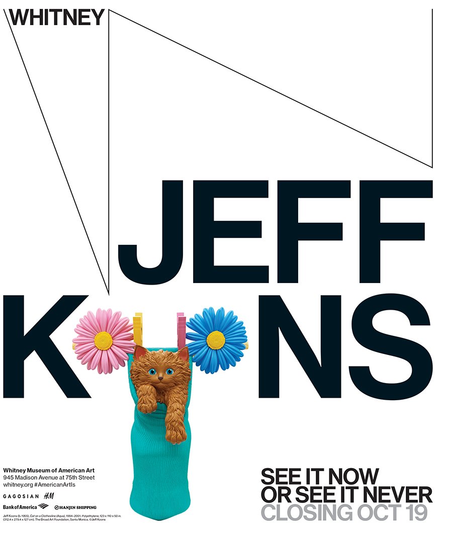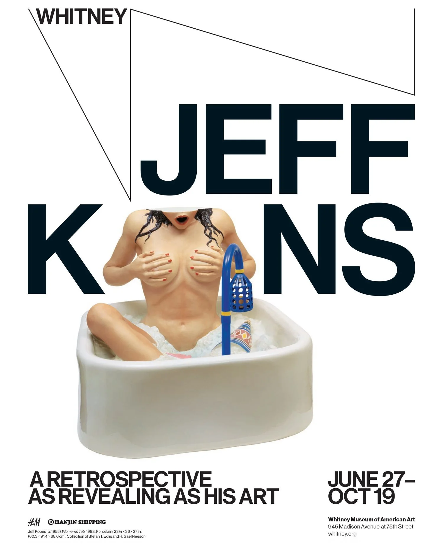
Jeff Koons personally signed off on this campaign for his first ever Retrospective.
This campaign put Koons' work front and center while emphasizing his status as an icon—an artist with a name so recognizable, we can tamper with its spelling, even when announcing his eponymous show.
The retrospective ended up being among the highest-attended shows in the Whitney museum's history.
Art in America, even wrote an academic article about my subway ad and called me a "lowly designer" but I was still flattered.
"This ad is a particularly stark example of the necessary conflicts and cross-purposes underlying the relationship between the contemporary artist and designer. Here, the lowly designers supply all the markers of aesthetic ambition in contrast to which the artist’s insipid imagery becomes legible as something more than kitsch. In turn, the image (of a cartoonish artwork that is actually among the most opulent luxury goods produced in recent memory) appears almost to taunt the typography (on this subway ad) for its air of uptight elitism."
Oh, and then someone tried to sell one of the stolen bus ads on ebay for $600.
Credits
Role: concept and design
Agency: Grey NY
Creative team: Michael Collins, Dan Alvarez, Nate Blowers
Photography courtesy of the Whitney Museum


